A review of safety signage for Queensland Parks and Wildlife Service
/prod01/channel_8/media/scu-dep/research/images/Mossman-Gorge.jpg)
Background
The natural beauty of Mossman Gorge, Daintree National Park, obscures the water hazards. Credit © Qld Government
Among the many elements of managing visitors to national parks, responsibility for the safety of visitors tends to override all others. Unlike managing safety on roads, in public spaces such as airports, and on worksites, however, managers of tourism and recreation settings seek to avoid safety management approaches that are overly aggressive or controlling and that impact negatively on visitor numbers and visitor enjoyment. Thus, even though fences, barricades and closures can effectively protect park visitors from dangerous sites, situations and activities, it is more often on-site communication rather than hard management intervention that is the go-to strategy. Due to large numbers of highly dispersed sites and limited resources, signs are the main on-site communication tool for safety messages in national parks.
This study was triggered by the challenges associated with park safety signage in today’s very crowded communication environment, including much communication that is not controlled by park managers. Incidents, injuries and deaths are almost always the result of visitors doing, or not doing, something that puts them at risk, such as standing too close to cliff edges, climbing or jumping off waterfalls, swimming or failing to wear a life jacket in dangerous water environments and, increasingly, the distraction associated with attempting to take photos, especially selfies. Risk-taking behaviour can be a consequence of visitors being exposed to messages from family, friends, and other social referent groups, both at the time and pre-visit, by way of personal communication, mass media, advertising, and increasingly what visitors read and view on their various electronic devices including social media.
Accidents with severe consequences in parks almost always lead to a formal investigation, with the park management authority required to account for what it did and did not do to minimise the risk. As such, a series of tragic deaths in Queensland’s National Parks in the first decade of the 21st century led QPWS to engage a Southern Cross University team to review their policies and practices with respect to the design and placement of safety signs. Professor Betty Weiler and her research team~ reviewed the scholarly literature, particularly empirical research underpinned by communication theory, developed a set of best practice principles, and used these to critically review the agency’s safety sign policies and the implementation of these policies at three sites.
~ 4-person team: Betty Weiler, Rob Saunders, Heather Zeppel, Pascal Scherrer
State government agencies within and outside Australia responsible for managing natural areas that provide public access and that pose risks to visitors. E.g. National Park Managers, Marine Park Managers and Traditional Owners.
Visitors to natural areas – locals, non-locals, domestic and international tourists.
Tourism operators licensed to take visitors into national parks.

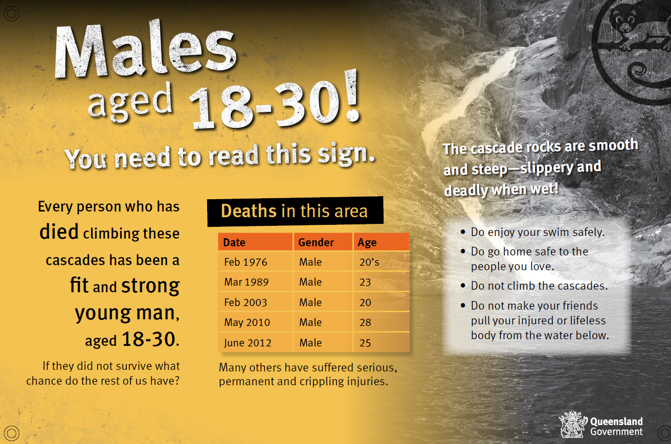
This sign at Eungella National Park targets a specific, at-risk visitor group at a site where serious injuries have occurred. Credit © Qld Government.
As a result of this study, QPWS has updated its safety sign policies, and produced and placed 170 new signs across the state, largely at sites nominated as being high priority. The updated policy and signs follow the best practice principles and guidelines for their use provided by the research team.
With today’s dense and messy communication environment, it is not possible to establish cause-and-effect between the design and positioning of a particular sign and its impact on reducing injuries or saving lives. However, QPWS in particular is confident that the study has ensured that their safety sign approach is the very best it can be – clear, consistent and coordinated. According to Jen Holt, Senior Project Officer, Interpretation and Signage, Queensland Parks & Wildlife Service:
We’ve implemented a series of sign manual workshops across the state. A large part of the workshop is devoted to safety signs and the background that underpins our approach. So we’re getting everyone on the same page and that’s very reassuring.
The outcomes of the review have proven to be scalable particularly within Australia. For example, Parks Victoria has used the best practice principles to review and update their safety sign policies and practices. Park management agencies in New South Wales, Western Australia and New Zealand have requested and used the study findings in internal reviews of their practices.
The 3-part study (1) reviews the latest literature and empirical research on visitor safety and signage in natural areas and develops best practice principles based on this review, (2) uses the BPPs to review current QPWS policy regarding the content, specifications and location of safety signs and (3) examines the implementation of policy and practice at three QPWS case study locations.
Best practice for on-site safety signage in national parks can be grouped under four themes:
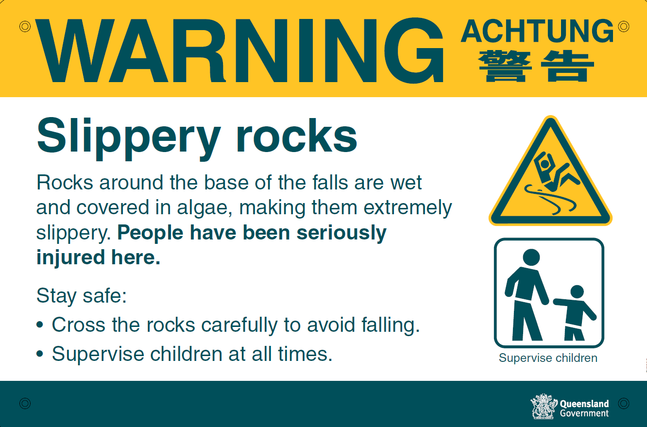
A warning sign at Wallaman Falls, Girringun National Park which simply states the hazard, possible consequences and appropriate safe behaviour. Credit © Qld Government
Safety signs must be noticeable. Features that contribute to this include using shape, size and colour in ways that contrast with the site’s surroundings. Careful placement, especially in relation to other surrounding informational signs, and the orientation of the sign in relation to the hazard can help draw attention to it.
Safety signs must be readily encoded. This is often achieved with effective graphic images of the hazard and short, familiar words. Large, well-spaced text that is easily read, including at a distance, is important in a natural environment that is full of “distractions”.
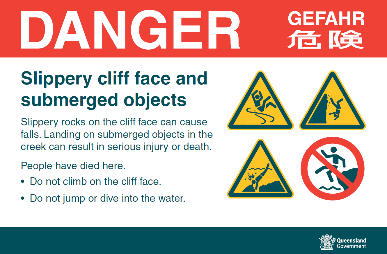
Safety signs must be easily comprehended. Signs that use clear signal words such as DANGER or WARNING, and the effective use of colours and symbols, are particularly helpful to non-English speaking visitors. There needs to be a clear message about what a visitor should and should not do, and the consequences.
Safety signs must be compliance-inducing. A key point here is that the sign needs to be close to the hazard. The use of a name and a logo can strengthen the message that the National Park agency has the authority to enforce compliance.
Of course, many design techniques achieve more than one principle. Safety signs are also more impactful when implemented as part of a broader visitor communication strategy that includes other media and other types of messages, including visitor education, persuasive communication and even role modelling, all of which can work together to complement and reinforce safe visitor behaviour.
The study was QPWS-funded and undertaken in 2015. An updated review of literature has been requested (2020).

/prod01/channel_8/media/scu-dep/current-students/images/Coffs-harbour_student-group_20220616_33-147kb.jpg)
/prod01/channel_8/media/scu-dep/current-students/services/counselling/images/RS21533_English-College-Student_20191210_DSC_6961-117kb.jpg)
/prod01/channel_8/media/scu-dep/study/scholarships/images/STEPHANIE-PORTO-108-2-169kb.jpg)
/prod01/channel_8/media/scu-dep/study/arts-and-humanities/images/RS20958_Chin-Yung-Pang-Andy_20190309__79I5562-960X540.jpg)
/prod01/channel_8/media/scu-dep/experience/images/SCU-INTNL-STUDY-GUIDE-280422-256-72kb.jpg)
/prod01/channel_8/media/dep-site-assets/component-library/screenshots/online-1X1.jpg)

